I’ve been toying with the idea of designing my own business cards for some time now, and I have a lot of fun looking at the creative solutions other people have come up with.
Here are a few of my favorites:
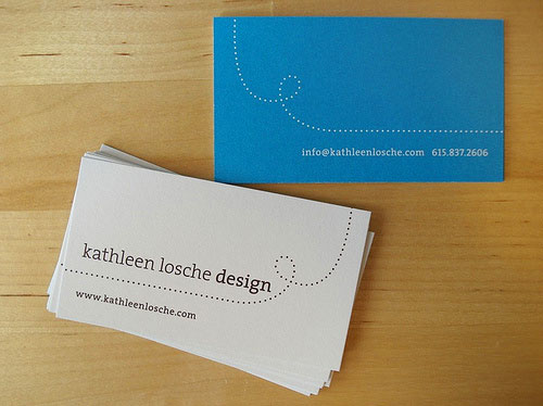 I don’t love the font or the colors, but I do like the way the front and back are tied together.
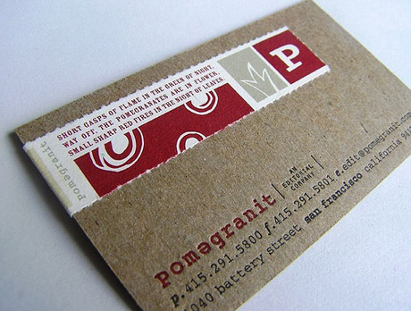
 I adore the style of the logo, which fits so well with all the other choices: the paper, organization, font.
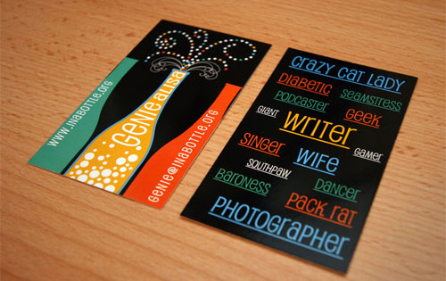 LOVE the front. Not a big fan of the back, particularly the shift in text direction.
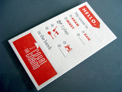 Really cute idea for a small group who will all have the same card.
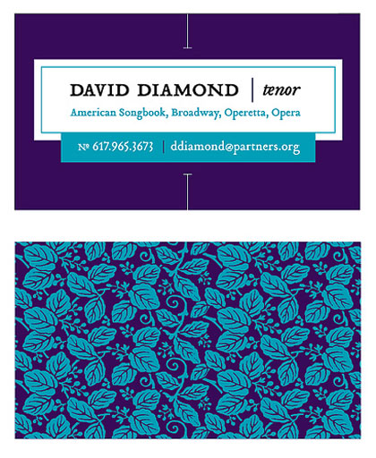 My only complaint for this one is the shade of purple; it makes the whole look much less sophisticated.
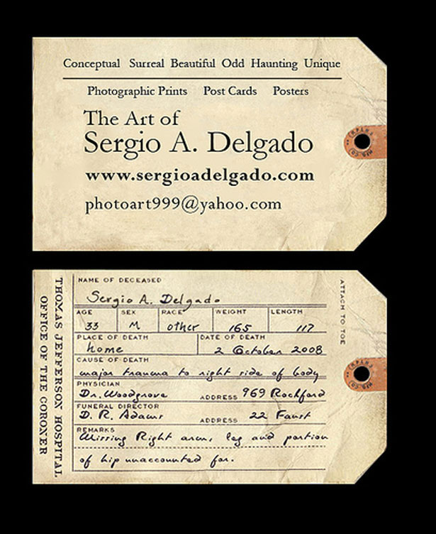
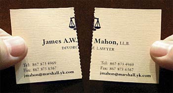 I’ve seen this one on a dozen blogs, and I still love it.
 I wish I could see the back of this card!
 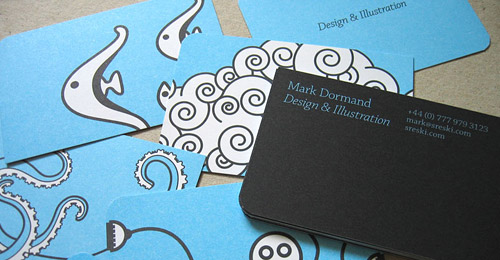 The colors are great; I like his illustration style as well as using multiple designs for the back.
 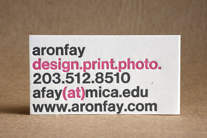 Simple, chic, to the point.
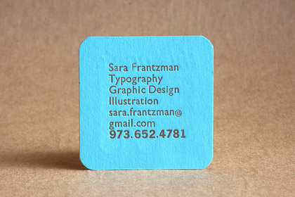 I’m torn on the idea of a square (or other shaped) biz card. I like it in theory, but a lot of blogs warn against it. Business card holders are made for a particular shape and size. What do you think about them?
I love this blue.
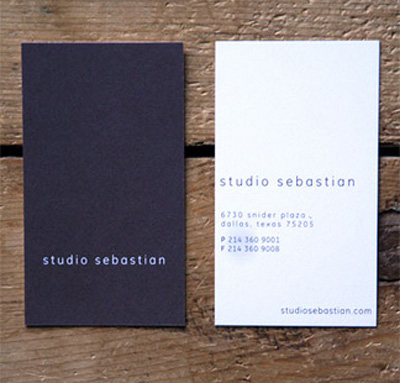 Very classic, but not boring. It stands out for its sophistication.
These and more can be found on the following blogs:
