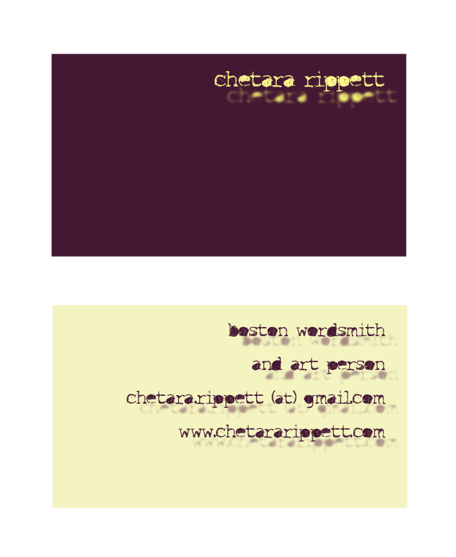
Here are a few I’ve mocked up. The text (along with everything else) is still up in the air.  This is my favorite so far. I don’t love the back, but I like the idea of incorporating watercolor. I would paint one side of the card with actual paint, and maybe use stamps for the text instead of printing. Could be pretty nifty.
 I’ve had this font on my computer for ages and I keep looking for a chance to use it. This might not be the best place, though.
 This idea was born out of a desire to play with typography. The clovers are made out of capital Cs. I prefer the back though; I think the clover could work but it needs more time. I love the colors.
As I make more, I’ll post them on here. Let me know what you think!
-C

My moneys on the middle one here. You have an interesting name, its probably your biggest immediate asset. Use the shit out of it.