


Obviously I’m a big How I Met Your Mother fan.
I’m really pleased with how it came out.
Recently sold to a young lady in Kentucky! That makes my second Etsy sale since I set up the account. Kind of the first, since the first sale never really happened, due to the buyer living in the Netherlands and the shipping being outrageously overpriced (cost estimate via UPS was $95 dollars. I’m still surprised).
Very, very badly.
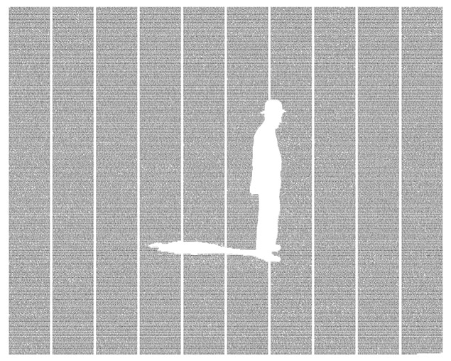
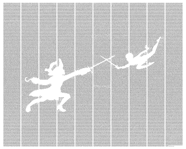
 Postertext produces posters that utilize text from a given book or story, arranged to depict a scene or iconic image. And I think that’s pretty rad. In their own words,
We create art that harmonizes literature with imagery in the form of beautiful, elegant posters.
Right now their collection is focused on classical literature, but hope to expand soon to include more modern works.
What a beautiful series.
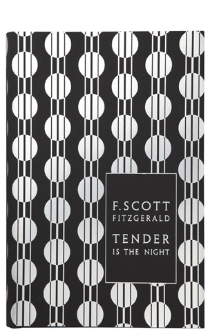
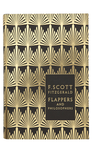

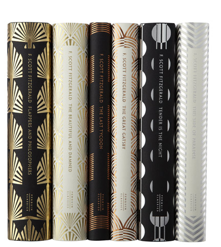
I think designing book covers is up there in my list of dream jobs.

More via.
More Via.

Here are a few I’ve mocked up. The text (along with everything else) is still up in the air.  This is my favorite so far. I don’t love the back, but I like the idea of incorporating watercolor. I would paint one side of the card with actual paint, and maybe use stamps for the text instead of printing. Could be pretty nifty.
 I’ve had this font on my computer for ages and I keep looking for a chance to use it. This might not be the best place, though.
 This idea was born out of a desire to play with typography. The clovers are made out of capital Cs. I prefer the back though; I think the clover could work but it needs more time. I love the colors.
As I make more, I’ll post them on here. Let me know what you think!
-C
I’ve been toying with the idea of designing my own business cards for some time now, and I have a lot of fun looking at the creative solutions other people have come up with.
Here are a few of my favorites:

 I don’t love the font or the colors, but I do like the way the front and back are tied together.
 I adore the style of the logo, which fits so well with all the other choices: the paper, organization, font.
 LOVE the front. Not a big fan of the back, particularly the shift in text direction.
 Really cute idea for a small group who will all have the same card.
") My only complaint for this one is the shade of purple; it makes the whole look much less sophisticated.
My only complaint for this one is the shade of purple; it makes the whole look much less sophisticated.

") I’ve seen this one on a dozen blogs, and I still love it.
I’ve seen this one on a dozen blogs, and I still love it.
") I wish I could see the back of this card!
I wish I could see the back of this card! ") The colors are great; I like his illustration style as well as using multiple designs for the back.
The colors are great; I like his illustration style as well as using multiple designs for the back. ") Simple, chic, to the point.
Simple, chic, to the point.
") I’m torn on the idea of a square (or other shaped) biz card. I like it in theory, but a lot of blogs warn against it. Business card holders are made for a particular shape and size. What do you think about them?
I’m torn on the idea of a square (or other shaped) biz card. I like it in theory, but a lot of blogs warn against it. Business card holders are made for a particular shape and size. What do you think about them?
I love this blue.
") Very classic, but not boring. It stands out for its sophistication.
Very classic, but not boring. It stands out for its sophistication.
These and more can be found on the following blogs:
