A few weeks ago I took inventory of my current portfolio and retired an identity system I created for the San Diego Zoo in my Design and New Media course, with Professor Judy Carter.
This was the logo I made:

I got a great review on it by the professor, and the rest of the students in the class, but the more I look at it now, the more it reads, ‘a student made me’. And if a Creative Director is looking at my portfolio, they can’t see ‘student.’ They have to see, ‘professional I want to hire’. So out it went.
Well, not entirely out. It’s in my ‘needs work’ folder. I’ve tried a few different executions, but so far nothing I’m pleased enough with to include in my portfolio.
Being able to self-edit means being self-aware about your work. In my process, I need some time away from a piece before I can look at it and say, this should be better. If I am writing a short story, and I’ve been working on it day in and day out, I need to step back so I can look at it objectively. In writing and in advertising, you need to look at your work as a viewer/reader would. The way someone who isn’t invested in it would.
Coco Chanel said, “When accessorizing, always take off the last thing you put on.” This helps you avoid looking sloppy and overdone. The San Diego Zoo logo/letterhead was the weakest link in my portfolio. So it had to go.
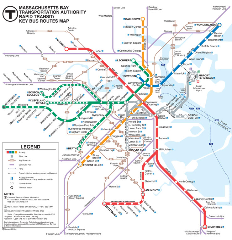
 For those not familiar, the MBTA currently uses this map:


